

Nowadays, responsive design is an important part of any website. It helps adjust your site on any screen. Modern CSS makes it easy for designers to build a responsive website with the help of @media rules.
In this article, we’ll learn together on how to build a responsive website with two CSS measuring units with complete explanations and examples.
Both em and rem are flexible, scalable units that are translated by the browser into pixel values, depending on the font size settings in your design.
As I mentioned above rem & em units are translated into pixels. Pixel is the main unit and fixed unit to measure each screen size.
How REM Unit Works?
Note: 1rem = 16px
For Example, in modern browsers the root font-size value is 16px, hence, 1rem = 16px.

Where to use REM Unit?
REM Unit provides flexibility in our design. REM Unit provides a great opportunity to change the whole site’s typography and spacing up and down just by changing the font-size in one place in a root element.
We can use this flexibility to make our designs easier to adjust during development, more responsive, and to allow browser users to control the overall scale of sites for maximum readability.
So, we conclude that rem is used where we want to make changes in a whole site because it gives us the opportunity to only change the font size in a single place.
How EM Unit Works?
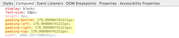
EM Unit is based on the font-size of the same element where it is defined, if the same element doesn’t have font-size defined, they will inherit their parent, or from another ancestor element, possibly going all the way back to the root of the document. When using em units, the pixel value is multiplied with the font-size of the given element.


Where to use EM Unit?
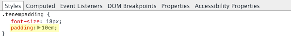
The key value em units offer is they allow sizing values to be determined by a font size other than that of the html element. Primary purpose of em units should be to allow for scalability within the context of a specific design element.
For example, you might set the padding, margin and line-height around navigation, menu item to use em values. This way if you change the menu’s font size the spacing around the menu items will scale proportionately, independently of the rest of the layout.
As per our example above, design components like menu items, buttons, and headings may have their own explicitly stated font sizes. If you change these font sizes, you want the entire component to scale proportionately.
Common properties this guideline will apply to are margin, padding, width, height and line-height settings, when used on elements with non-default font sizing.
Responsive web design using REM & EM Units
Now that we have understood everything about REM & EM Units and how they work. It’s time to see how we use this flexibility to build a responsive website.
Most of the spacing and sizing is adjusted by the REM unit by defining the font in the root element.
An important thing to keep in mind is that always use percentage values when defining the font-size value in the root element, e.g, HTML. The benefit of using percentage over pixels is that our root element is no longer has a fixed hard-coded value.
html{
   font-size: 62.5%; // 10px
}
Always use the em unit while working with media queries because it works well in all browsers and the rem unit somehow failed in some browsers. Also, an em-based approach to media queries allows for a more proportional measurement and layout that adjust based on font-size.
@media(max-width: 68.75em){ ... } // 1100pxI found a very good resource by webdesign.tutsplus.com’s article which mentioned some good key points which are very useful:
remandemunits are computed into pixel values by the browser, based on font sizes in your design.emunits are based on the font size of the element they’re used on.remunits are based on the font size of thehtmlelement.emunits can be influenced by font size inheritance from any parent elementremunits can be influenced by font size inheritance from browser font settings.- Use
emunits for sizing that should scale depending on the font size of an element other than the root. - Use
remunits for sizing that doesn’t needemunits, and that should scale depending on browser font size settings. - Use
remunits unless you’re sure you needemunits, including on font sizes. - Use
remunits on media queries - Don’t use
emorremin multi column layout widths – use%instead. - Don’t use
emorremif scaling would unavoidably cause a layout element to break.
After reading the whole article with small examples of code, this is will be cleared that how flexible em & rem units are in CSS. and how we build a better responsive using these two units in our design.

